Customizing Finishes For Architectural Consistency begins with more than selecting attractive colors. It requires reading the building’s structure, natural light, circulation patterns, and daily use. A warm oak wall may support a hospitality lobby, yet appear too heavy beside polished concrete. Small decisions matter.
Design authority Charles Eames stated, “The details are not the details. They make the design.” His observation remains valuable when coordinating stone, timber, metal, paint, glass, and fabric across connected spaces. Consistency does not mean making every surface identical. It means giving each finish a clear relationship with the architectural language.
A reliable process starts with physical samples. View them beside window frames, door hardware, flooring, and existing masonry. Check them in morning light and under evening illumination. Record undertones, gloss levels, texture, and maintenance requirements. A brushed bronze sample can look refined in a studio, then appear orange beside warm lighting. That difference is easy to miss.
Site experience also matters. Designers should inspect mock-ups, photograph transitions, and ask installers how edges will perform. An elegant specification can fail at a poorly aligned joint. This approach is not flawless. Budgets shift, materials become unavailable, and real buildings reveal unexpected conditions.
The strongest finish strategy allows controlled variation. Repeated tones can guide movement, while contrasting textures identify thresholds and focal points. Practical judgment remains essential. A visually consistent scheme must also withstand cleaning, touch, moisture, and time. That is where design intent becomes credible.
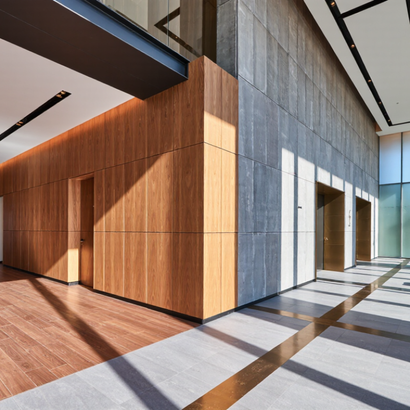
Architectural consistency begins with a clear vision, not a finish schedule. Define the building’s character in practical terms: calm, tactile, durable, or deliberately raw. Then translate those words into measurable objectives for color, reflectance, texture, aging, maintenance, and replacement. A lobby with honed stone, brushed metal, and warm timber needs a shared visual logic. Otherwise, each material may look attractive alone but confused together.
Set performance targets before selecting samples. The 2023 Global Status Report for Buildings and Construction reports that buildings and construction produced 37% of global energy-related emissions in 2022. Finish choices should therefore support durability, repairability, and responsible resource use. Specify recycled content only when documentation is available. Require slip resistance, cleaning tolerance, VOC information, and lightfastness where relevant. These details protect the design vision after handover.
I have seen beautiful mock-ups fail under uneven lighting. It happens. Review full-size samples beside actual daylight, ceiling fixtures, hardware, and adjacent finishes. Record acceptable variation, grout width, edge conditions, and installation direction. A 2021 World Green Building Trends report found that 42% of respondents expected most of their projects to pursue green construction by 2024. That ambition needs disciplined finish objectives, not vague sustainability language. Leave room for revision. A perfect visual standard may still be impractical for local labor, budget, or future repairs.
Architectural consistency begins with an honest audit, not a color board. Photograph existing floors, wall panels, stone, timber, and metal under morning and evening light. Record gloss, grain direction, joint widths, and visible wear. A warm beige can appear gray beside blue-white LEDs. Small differences become obvious across a long corridor.
Lighting deserves equal attention. The U.S. Environmental Protection Agency reports that people spend about 90% of their time indoors, making visual comfort a practical design concern. The 2024 Global Status Report for Buildings and Construction also identifies buildings as responsible for roughly 32% of global energy use. Efficient lighting matters, but efficiency alone cannot preserve material character. Measure illuminance, shadow depth, glare, and color temperature in occupied spaces. Check these readings against the intended atmosphere.
Samples should remain in place for several days. My first textile selection looked balanced in the studio, yet appeared green beside existing stone. That mistake was useful. It exposed the danger of judging isolated swatches. Use larger samples, photograph them at different hours, and compare them beside fixed architectural elements. A finish with slight variation may integrate better than a perfect match. Record every decision, including uncertainty. Review the palette with the lighting designer and facilities team before approving substitutions. Small changes in reflectance can alter perceived brightness, cleaning visibility, and maintenance demands.
Existing-condition assessment matrix for coordinating architectural finishes across adjacent spaces while preserving material performance, visual continuity, and lighting compatibility.
| Space / Zone | Existing Material | Texture and Sheen | Observed Color | Lighting Conditions | Condition Assessment | Recommended Finish Direction | Priority |
|---|---|---|---|---|---|---|---|
| Main Entrance | Honed natural stone flooring with painted gypsum walls | Low-sheen floor with fine mineral variation; smooth eggshell wall surface | Warm beige and soft ivory | Daylight from glazed doors; warm-white downlights in the evening; moderate glare near the threshold | Floor remains serviceable, but traffic paths show mild darkening and localized scratches | Retain the stone palette; use a durable low-sheen wall coating and a slip-resistant replacement only where damage is concentrated | Review |
| Reception Area | Textured plaster feature wall and wood veneer reception desk | Hand-troweled vertical texture; satin wood surface with visible grain | Medium natural wood with warm gray plaster | Diffuse daylight with vertical wall-wash lighting; shadows emphasize plaster irregularities | Materials are visually coherent; veneer has minor edge wear at the counter base | Match the wood tone and grain direction; preserve the plaster texture and repair only damaged veneer edges | Consistent |
| Open Work Area | Modular carpet tile and painted acoustic ceiling | Fine loop pile; matte, lightly stippled ceiling finish | Cool medium gray with off-white ceiling | Primarily neutral LED panels with limited side daylight; uniform horizontal illumination | Carpet has visible wear along circulation routes and slight color variation between replacement batches | Use a low-pattern carpet with a controlled gray value; confirm sample appearance under 3500–4000 K lighting before installation | Replace Zones |
| Conference Room | Acoustic fabric wall panels, timber door, and resilient flooring | Textile surface with subtle weave; clear-finished timber; matte resilient floor | Muted blue-gray, natural timber, and charcoal | Low daylight penetration; dimmable ceiling fixtures and concealed perimeter lighting | Color remains stable, although the fabric appears darker under dimmed light levels | Maintain the blue-gray family; select a fabric with similar reflectance and verify color at both full and dimmed output | Review |
| Primary Corridor | Painted gypsum walls, ceramic wall protection, and carpet tile | Low-sheen painted walls; smooth semi-gloss ceramic panels; low-loop carpet | Warm white, pale gray, and medium gray | Linear ceiling lighting with intermittent daylight; strong grazing light at wall intersections | Wall paint shows scuffing at corners; ceramic panels remain intact and visually consistent | Use washable low-sheen paint with the same light-reflectance character; retain ceramic protection at high-contact areas | Review |
| Restrooms | Porcelain wall tile, porcelain floor tile, and solid-surface vanity | Mostly matte tile with selected satin accent strips; smooth non-porous vanity | Light gray, white, and restrained charcoal accents | High-output neutral-white lighting; low daylight contribution; pronounced reflections around mirrors | Grout joints are discolored in wet zones; tile surfaces are generally intact | Retain the neutral tile range; renew grout with moisture-resistant material and avoid highly reflective replacement tile | Renew Grout |
| Stairwell | Painted concrete walls, exposed metal handrail, and rubber stair treads | Matte wall finish; smooth powder-coated handrail; ribbed anti-slip tread texture | Light gray walls with dark charcoal details | Low daylight; wall-mounted fixtures create directional shadows on landings | Handrail coating is stable; tread nosings show moderate wear at turning points | Keep the high-contrast safety palette; replace worn nosings with matching texture and verify edge visibility under low light | Review |
| Café / Break Area | Wood-look flooring, painted walls, and compact laminate counter | Embossed wood grain; washable eggshell walls; lightly textured satin counter | Honey oak, warm white, and muted green-gray | Mixed daylight and warm decorative pendants; changing color appearance throughout the day | Floor has minor moisture-related edge swelling near the sink; wall finish is stable | Replace damaged flooring with a moisture-tolerant wood-look finish; coordinate undertones with existing timber and pendant light | Replace Zone |
| Exterior Covered Walkway | Textured concrete paving, painted metal soffit, and masonry wall | Medium-broom concrete texture; smooth semi-gloss metal; lightly raked masonry joints | Natural gray, off-white, and subdued earth tones | Direct and reflected daylight with seasonal variation; exterior fixtures operate after sunset | Paving remains functional, but exposed surfaces show staining and uneven weathering | Use compatible mineral-based colors and a breathable exterior coating; avoid finishes that create strong gloss differences | Review |
Finish selection should begin with the surface, not the color palette. Porous stone, sealed concrete, timber, and coated metal each respond differently to moisture, abrasion, and cleaning chemicals. A finish that looks consistent in a showroom may fail beside a sink, entrance, or service corridor. Practical mock-ups reveal these conflicts early.
Indoor performance also matters. The U.S. Environmental Protection Agency reports that people spend approximately 90% of their time indoors. Therefore, low-emission coatings and adhesives deserve careful review, especially in bedrooms, schools, and healthcare areas. Ask for verified emissions data, maintenance instructions, and slip-resistance results. Do not rely on appearance alone.
Environmental impact adds another requirement. The 2024 Global Status Report for Buildings and Construction states that buildings represent about 34% of global energy demand and 37% of energy-related emissions. Durable finishes can reduce replacement waste, but durability is not automatic. A harder surface may become unsafe when wet, while a softer coating may need frequent renewal. That trade-off is easy to miss. I would also question perfect visual matching; slight variation can improve repairability and reduce unnecessary replacement. Compatibility should be checked across substrate, exposure, cleaning method, and expected service life. The specification may still need revision after real-world testing.
Architectural consistency begins with coordinated finish samples, not isolated product selections. Review stone, wood, metal, paint, and grout together under the project’s actual lighting. A finish that looks balanced in a showroom may appear harsh beside a cool-toned wall. Place samples at corners, door openings, and ceiling junctions. Photograph them during morning and afternoon light.
Transitions need the same attention. Align flooring changes with door centers, control joints, or major furniture lines whenever possible. Confirm the transition profile, height, and edge condition before approving shop drawings. A two-millimeter difference can create a visible shadow or trip point. Small errors compound. Measure twice.
Installation details should show how finishes meet in real conditions. Include substrate preparation, adhesive coverage, movement joints, sealant color, and acceptable tolerances. Build a full-size mockup with at least one corner and one transition. Invite the installer to review it, because field knowledge often exposes design assumptions. On one renovation, a carefully selected stone failed at the skirting because the wall was not flat enough. The specification was correct, but the detail was incomplete.
Keep an approved sample board with dated photographs and written acceptance notes. Record which surfaces may vary naturally, and identify where visual alignment is mandatory. This creates a reliable reference for procurement, site inspections, and replacement work. Perfect consistency is rarely possible, but controlled variation can still look intentional. There is room to improve.
A unified architectural finish should be reviewed as one complete environment. Examine walls, flooring, metalwork, glass, and joinery under the same lighting conditions. Daylight may reveal warmer tones than evening fixtures. Small differences become obvious near door frames and corners.
I usually create a finish map before approving the final scheme. It records material samples, sheen levels, grout colors, edge details, and installation locations. Walk through the space slowly. Check how finishes meet at thresholds, stair landings, and service areas. A matte wall beside polished metal can create unwanted visual tension. Texture matters too. Smooth surfaces reflect light, while brushed or porous finishes soften it. Not every selection works equally well.
The unified result should also be tested for long-term consistency. Review sample panels after cleaning, handling, and several lighting changes. Look for fingerprints on dark surfaces, fading near windows, and uneven wear along circulation paths. A finish may appear attractive in a small sample but feel excessive across a large wall. That happened on one project I reviewed. The color was accurate, yet its strong reflection made the corridor uncomfortable. We reduced the sheen and adjusted nearby hardware. The improvement was subtle, but more durable. Keep a documented approval record, including photographs and maintenance notes. Revisit it when substitutions or repairs are proposed. Consistency depends on disciplined review, not visual matching alone.
Review the unified result and refine finish selections using 60° gloss-unit ranges to maintain a consistent visual language across architectural surfaces.
Lower gloss levels generally reduce visual contrast and are suitable for broad, continuous surfaces, while higher gloss levels create stronger highlights and require tighter specification control. Gloss is measured in gloss units using a 60° geometry, consistent with common coating evaluation practice.
Describe the desired character with practical words, such as calm, tactile, durable, or raw. Translate those words into targets for color, texture, reflectance, aging, and maintenance. A shared visual logic matters.
Set targets for durability, repairability, slip resistance, cleaning tolerance, VOC information, and lightfastness. Request recycled-content documentation when relevant. Beautiful finishes still need evidence.
Lighting can change how colors, textures, and gloss appear. Check samples beside daylight, ceiling fixtures, hardware, and nearby finishes. Morning and evening views may differ sharply.
Photograph floors, wall panels, stone, timber, and metal at different times. Record gloss, grain direction, joint widths, wear, shadows, and glare. A warm beige may look gray beside cool lighting.
Use large samples whenever possible. Keep them in place for several days. Review them beside fixed architectural elements and actual lighting. Small swatches can mislead.
A finish map records materials, sheen levels, grout colors, edge details, and installation locations. Use it to review thresholds, stair landings, corners, and service areas. It exposes awkward transitions.
Review sample panels after cleaning, handling, and lighting changes. Check fingerprints, fading near windows, and uneven wear along busy paths. Large surfaces behave differently.
Compare proposed replacements with approved samples, photographs, and maintenance notes. Check color, reflectance, texture, edge conditions, and cleaning requirements. I once trusted a perfect color match. Its strong reflection still made the corridor uncomfortable.
Customizing Finishes For Architectural Consistency begins with a clear understanding of the project’s architectural vision and the atmosphere it is intended to create. Establishing finish objectives helps guide decisions about durability, visual harmony, maintenance, and performance. Before selecting new materials, review the existing surfaces, textures, colors, natural light, and artificial lighting conditions. This assessment reveals which elements should be preserved, adjusted, or visually balanced.
The next step is to choose finishes that work together while meeting the functional requirements of each space. Carefully coordinated samples can clarify how materials interact, especially at edges, junctions, and transitions between different surfaces. Installation details should be reviewed early to prevent inconsistent lines, tones, or textures. Finally, evaluate the completed result from multiple viewpoints and under changing light conditions. Small refinements to color, sheen, texture, or placement can strengthen the overall unity and help the design remain consistent, practical, and visually cohesive over time.

YVC Home